Lekko.Yoga
📖 For Busy Readers - quick summary
The Challenge: Design a yoga studio website that captures the unique "energy and vibe" of classes, but with limited budget and no professional photography of the actual practicing community.
My Approach: Became a photographer for a day, shot an intimate workshop, then extracted the entire color palette from those authentic photos rather than designing colors theoretically.
The Outcome: A minimalist one-page Webflow site where budget constraints pushed me into multi-disciplinary problem solving, resulting in a more authentic visual identity than any mood board could have achieved.
Key Insight: Sometimes the best design solutions come from saying "yes" to uncomfortable roles outside your primary discipline.
🎤 Meeting Magda & Lekko Yoga
In early August 2025, Magda reached out to me. She owns Lekko Yoga, a yoga studio nestled in one of Wrocław's neighborhoods. She runs regular classes and workshops, offering various yoga styles for practitioners at different experience levels. In Magda's words, the practice should be "interesting, pleasant, and therapeutic for both body and mind."
Her main need? An interactive website that would serve as a tool to attract new clients, maintain relationships with current ones, and educate people about physical and mental wellbeing.
Simple enough, right? Well, as I'd soon discover, there was more to this story than just creating another yoga studio website.
🧙🏼♂️ My Role
I wore multiple hats on this project. I started as a UX/UI designer tasked with creating a web presence for Lekko Yoga. But as the project evolved, I found myself translating brand identity into digital experience, and eventually, stepping behind the camera as a photographer to capture the authentic energy of Magda's workshops. I've been an amateur photographer for about 5 years - self-taught through repetition and practice - so when budget constraints ruled out professional photography, I saw an opportunity to contribute in an unexpected way. It was one of those projects where the boundaries between disciplines blur in the best possible way.
🎯 Goals, Audiences, and the "Vibe" Requirement
Defining What Success Looks Like
During our first meeting, Magda and I mapped out the core objectives for the new website, always keeping her diverse client base in mind:
Main Goals:
- Engage a diverse audience - Showcase the offering of classes and workshops while educating visitors about yoga's health benefits
- Educate visitors - Provide educational resources about the benefits of regular yoga practice, its impact on healthy lifestyle, and self-care
- Encourage sign-ups - Create an intuitive experience with an easy reservation system that motivates people to participate in classes and workshops
The Three-Audience Challenge
What made this particularly interesting was that Lekko Yoga serves three distinct groups:
Beginner Group - Perfect for people just starting their exploration of yoga and its benefits
General Group - For intermediate practitioners; these classes are more intensive and require some experience
Mature Group - Gentle sessions adapted to the needs of mature bodies
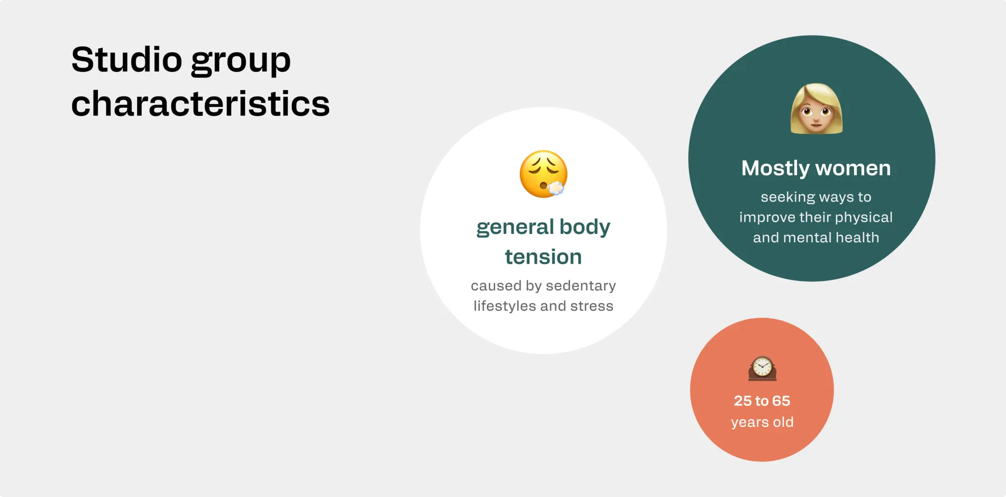
The target audience spans ages 25-65, predominantly women seeking ways to improve their physical and mental health through yoga practice. Many experience back pain, wrist discomfort, and general body tension caused by sedentary lifestyles and stress. They're searching for places where they can feel part of a community and gain knowledge about healthy living.
Based on all this, I created a one-sentence north star to guide my decisions:
The site should be simple to navigate, enable easy reservations and sign-ups for classes and workshops, provide current schedule information and available courses, and offer educational resources along with reviews from other participants.
This became my compass whenever I needed to make a design decision.
🧩 The Missing Piece
The Reality Check
Our second meeting revealed both opportunities and challenges. Magda showed me a previous website design that someone had created for her but was never implemented. She also shared her current logo design and several photos from a portrait session. We discussed aesthetics and structure.

Aesthetic Direction: Modern and bold, with an urban character reflecting yoga culture. Vibrant but balanced colors ensuring readability and accessibility.
Navigation Approach: Intuitive and user-friendly with responsive design optimized for all devices.
But then came the crucial conversation about budget constraints.
The "Energy" Problem
"What sets Lekko Yoga apart from other studios is the ENERGY, the vibe during classes."
- Magda
The challenge? The photos and videos she had primarily featured her as the owner/instructor. To achieve the intended effect, we were missing images of the practicing group, people actively spending time in classes, group integration moments, and that intangible sense of community.
Professional photography or videography was beyond the budget. We had to get creative.
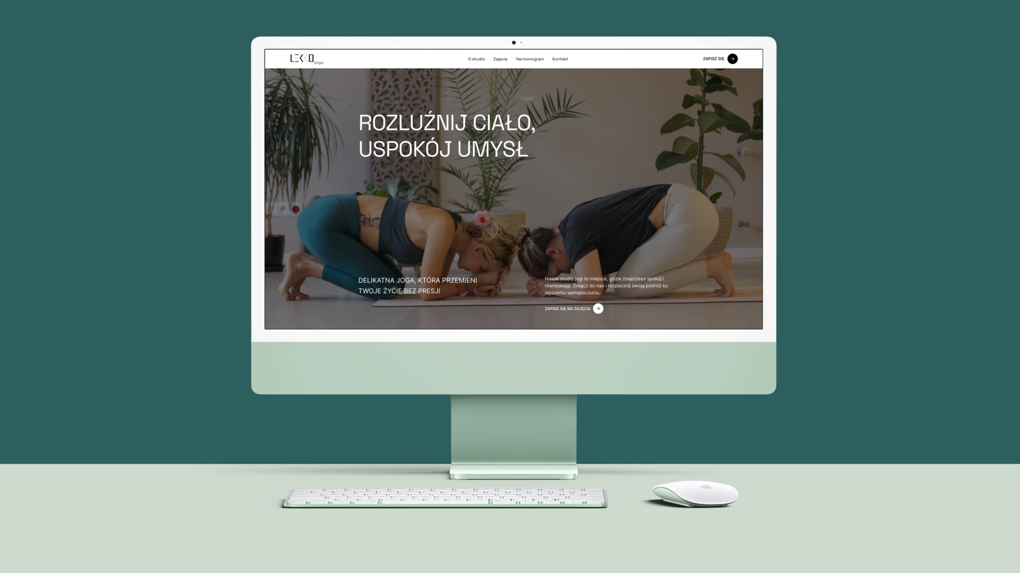
That's when we made a decision: we'd create a simple, minimalist one-page site featuring authentic photos from actual workshops. Having spent the last 5 years as an amateur photographer - learning through repetition and practice - I felt confident I could capture the authentic moments we needed, even if it meant stepping outside my comfort zone. Sometimes the best creative solutions come from embracing multiple disciplines rather than staying safely in one lane.
🎨 Building the Visual Foundation
Deconstructing the logo to understand "Strength in Lightness" - the philosophy that would guide everything.
Before I could think about photography, I needed to understand the brand's visual language. Magda's logo became my starting point.
Deconstructing the Logo: "Strength in Lightness"
The Lekko Yoga logo is really good design in terms of visual balance. The name "LEKKO" uses a bold, geometric sans-serif typeface - modern and architectural. Meanwhile, "yoga" is rendered in a much lighter, delicate lowercase font, creating an intentional contrast.
The Visual Philosophy:
- Minimalist modern approach - clean, uncomplicated design with plenty of white space
- Geometric abstraction - simplified and structured letter forms
- Play of contrasts - heavy/light font weights create visual hierarchy
- Directional elements - angular K's suggest movement and flow
Color Palette from Logo: Soft, calming turquoise/sea background + black wordmark + strategic white accent
The logo embodies contemporary wellness branding - combining strength and structure with delicate, approachable nature. It was clearly inspired by Scandinavian/Nordic design principles - clean, functional, and refined while remaining approachable and calming.
Translating Brand to Web
With this understanding, I began exploring how to translate "Strength in Lightness" into a web experience: clean architectural layouts with breathing room, bold typography for impact with delicate accents for gentleness, visual hierarchy that guides without overwhelming.
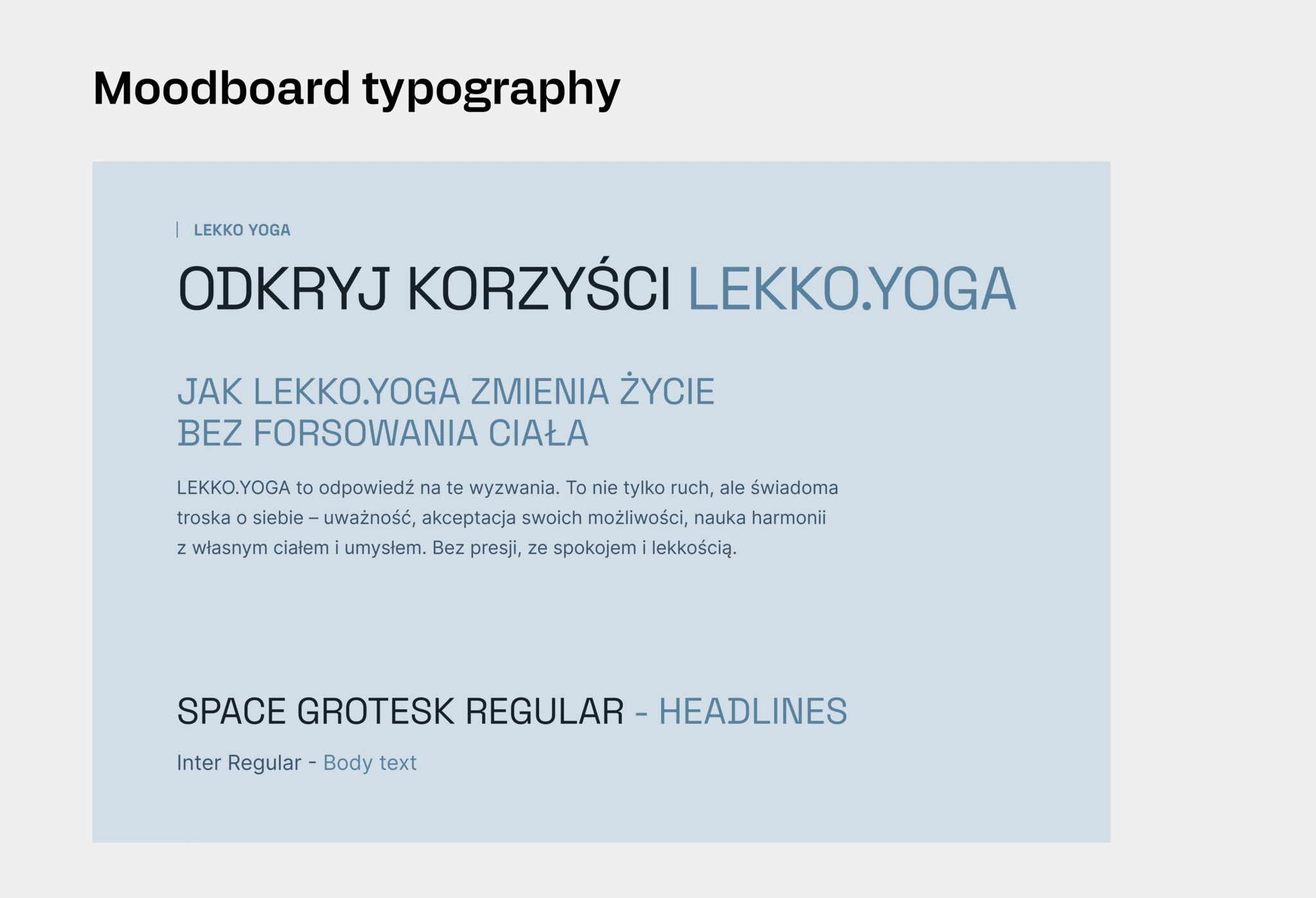
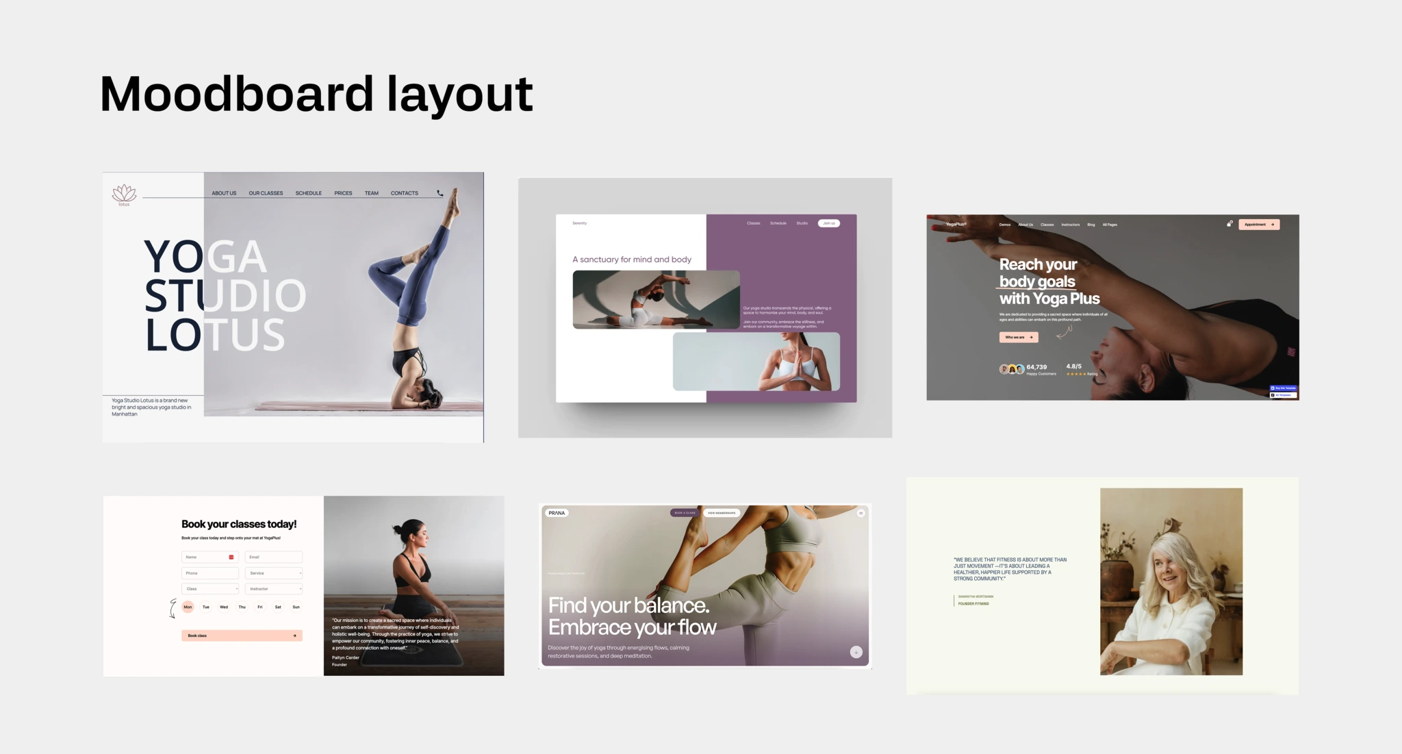
I prepared a moodboard showcasing typography choices, initial color palette, and layout concepts - all based on the logo, portrait photos, and previous website design.

📸 Photoshoot to Capture Energy
The Color Struggle
I presented my moodboard to Magda. Good news: she approved the typography and layout direction. The challenge? The colors felt energetically mismatched.

Magda asked if I could try warming them up. This was tricky - I'd derived them from the logo, but clearly something wasn't resonating.
We decided to move forward with the approved layout, trusting that the photography session would help us solve the color puzzle.
Becoming the Photographer
A month later, Magda organized an intimate workshop where I could step into the photographer's role for about 2 hours.
Going into the workshop, I had a clear advantage: Magda had approved the layout structure, and we'd worked out the optimal one-page architecture. I knew exactly what shots I needed and which sections would require visual content.
But I kept reminding myself:
These photos on the website will likely be a client's first contact with the studio. Show how the studio looks, the practicing group, the instructor - but most importantly, show the light and friendly atmosphere. - Myself
The Shoot
The workshop took place on a weekend with just a few participants - as I learned later, they were the "top students" who had been regularly attending Magda's classes for a long time.
I was more of an observer (photographer) than a participant in the room, but even so, I could feel how beautifully Magda built a pleasant and relaxing atmosphere. I was genuinely impressed by all the participants' engagement and the hard work they put into that two-hour workshop.
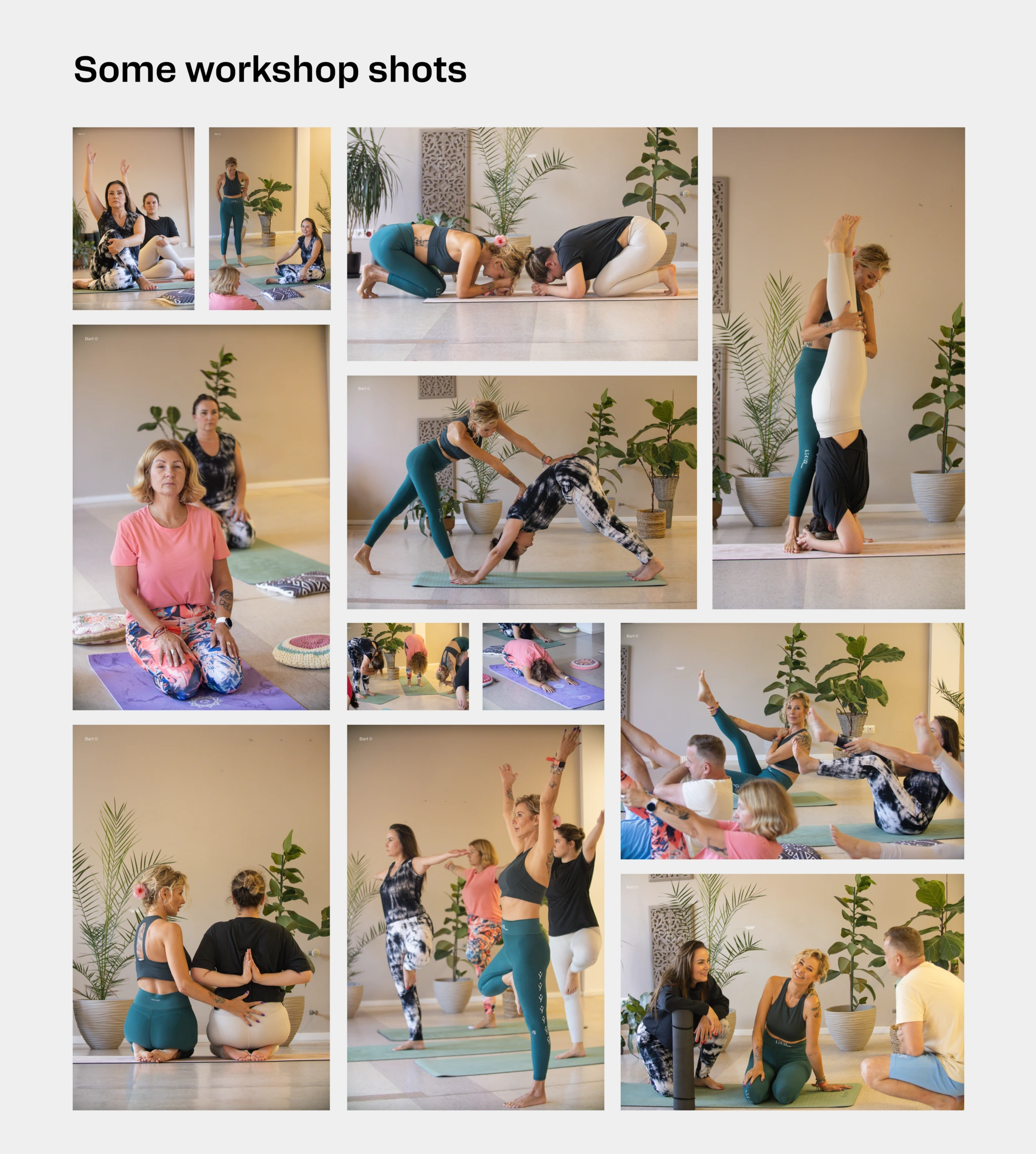
I hoped my presence with a camera didn't cause anyone special discomfort. To minimize any awkwardness, I specifically brought my 70-200mm lens 🙃. It allowed me to capture intimate moments while maintaining respectful distance.
Click HERE to check out all pictures from that workshop
The Unexpected Solution
The result of these unique workshops was a dozen or so one-of-a-kind photos, some of which you'll see on the Lekko Yoga website.
But here's where something magical happened: Magda absolutely loved the photos. They captured exactly what we'd been trying to articulate - that energy, that vibe, that sense of community and focused practice.
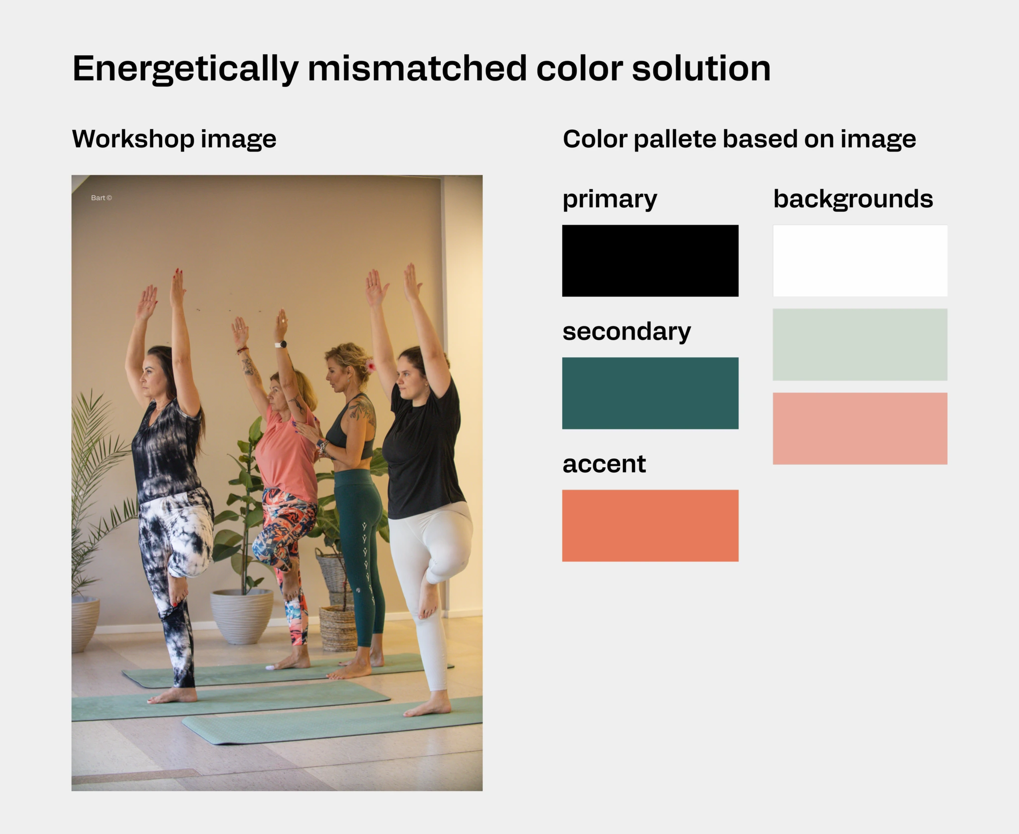
Looking at them, I had an idea. What if we extracted the repeating colors directly from these workshop photos to create the website's color palette? The images were already authentic to the studio, already approved by Magda, already warm and inviting.
And just like that, we solved our "energetically mismatched" color problem. The palette was born from reality, not theory. The photos didn't just provide visual content - they provided the entire visual system.
🌐 Building in Webflow
I'd designed the site with Webflow in mind from the beginning, which made the build process smooth. I utilized the Relume component library, making slight modifications to some components to match our specific needs. Within a few hours, the site was ready for testing.
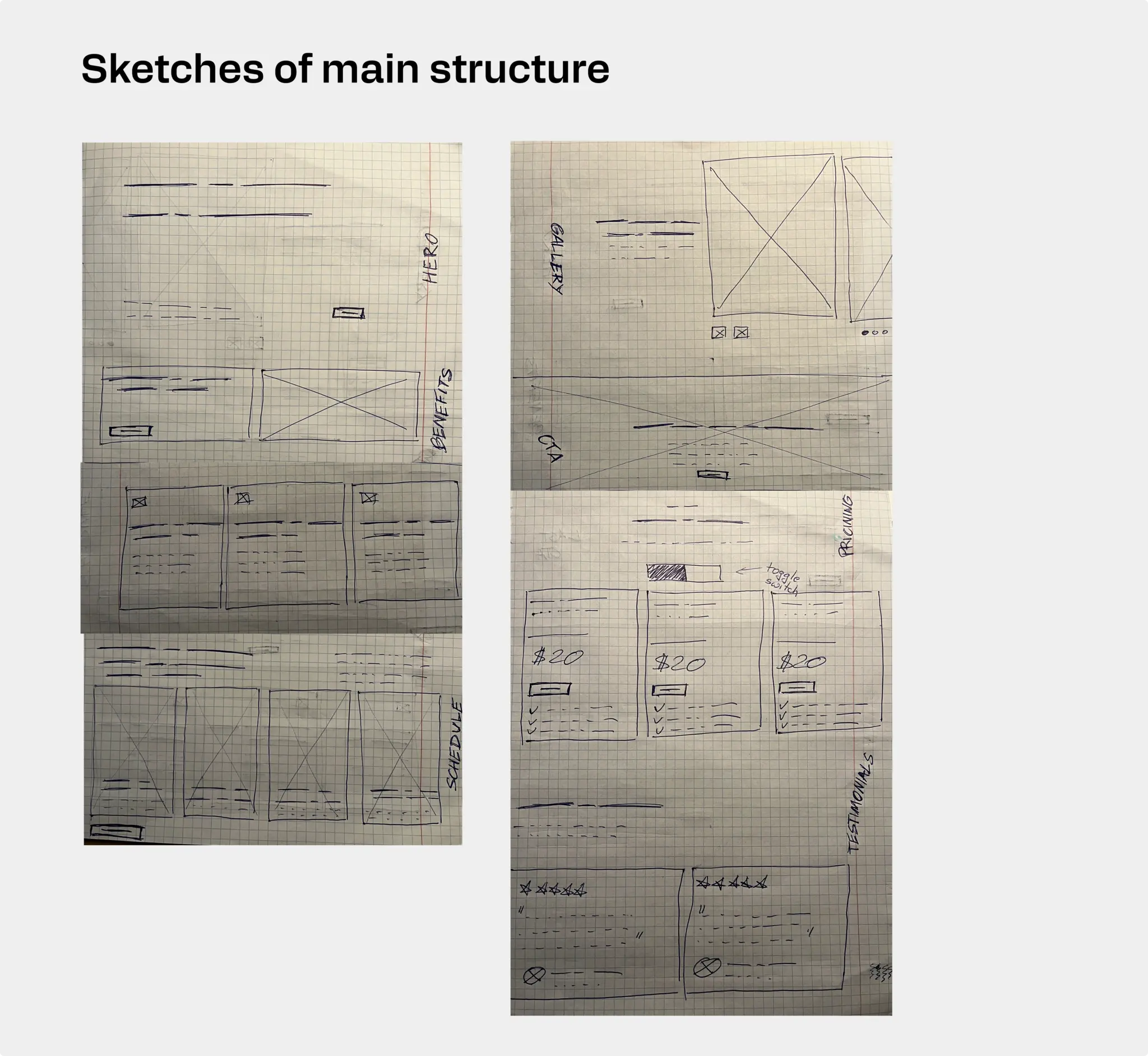
The One-Page Structure: Our minimalist approach meant every element had to earn its place. The single-page format forced clarity and prioritization - perfect for a studio that serves three distinct audience groups but shares a unified message of accessible, community-focused yoga practice.
The responsive design ensures the experience feels light and intuitive whether you're browsing on a phone between meetings or exploring on a desktop at home planning your week.
🌈 Impact & What's Next
The prototype is currently in testing phase, with plans to launch on the lekko.yoga domain in early November 2025.
Magda's excited about what's ahead. She's planning to focus on social media development and promoting her brand through Instagram and Facebook. Further website development will be closely tied to overall brand evolution. She's also planning to track site traffic and adjust content based on her clients' expectations - keeping that same responsive, community-focused approach that defines her teaching.
🧐 Reflections?
This project reminded me that constraints aren't limitations - they're creative catalysts. A limited budget pushed me to pick up a camera. The missing "energy" in existing photos forced us to create authentic moments rather than staged ones. The color struggle led us to extract palette directly from reality.
Sometimes the best solutions come from saying "yes" to uncomfortable challenges - like becoming a photographer for a day with nothing but a 70-200mm lens and a hope that you won't disturb anyone's savasana.
I truly enjoyed working with Magda on bringing Lekko Yoga's digital presence to life. Her passion for creating accessible, therapeutic yoga experiences made every meeting energizing, and her trust in letting me explore multiple roles made this project feel collaborative in the best way.
The site isn't just a portfolio piece for me - it's a reminder that good design often happens when you're willing to step outside your primary discipline and embrace the full scope of what a project needs.